Free shipping on 10+ swatches
Free shipping on swatch kits
2-3 days delivery time
Free shipping on 10+ swatches
Free shipping on swatch kits
2-3 days delivery time
Klint Homes
Katherine Plumb
Katherine Plumb, also known as 'KJP,' is a textile designer and screen printer from south London, currently based in Stockholm, Sweden. Renowned for her vibrant and handcrafted designs, we'll explore how she has adorned her summer house with colours from Klint.
Katherine's colours
Where are we, and how did you end up here of all places?
We’re pretty much in the middle of nowhere, just outside of a small town called Skinnskatteberg. I have no idea how I’ve ended up here as someone who grew up in a small town in the south of England, but I think it has something to do with the Swedish dream of owning a summer house, and needing it to be close enough to Stockholm for a long weekend getaway…
What do you like the most about your home?
Where do I begin? I love the huge garden that turns into forest, I love the history of the house (it was an old miners house from the late 1800s), and I really love the old, round Masonry heater in the living room - even with its flaws.
Describe yourself in one sentence!
A creative, yes-person who doesn’t mind getting their hands dirty.

"Don’t rush any part of the process - take your time choosing the colours, preparing the walls and definitely spend a good amount of time taping and covering things."
What was your thinking behind the colour scheme in your home?
I think we wanted cool, calming colours for this house, since it’s where we’ll come to get away and relax. But I also wanted to pick colours that could work together if we wanted to do accent areas/pieces, so they needed to be able to compliment each other in some way, and also the furnishings that we eventually plan to have in the house.
Which colours did you choose and what attracted you to them in particular?
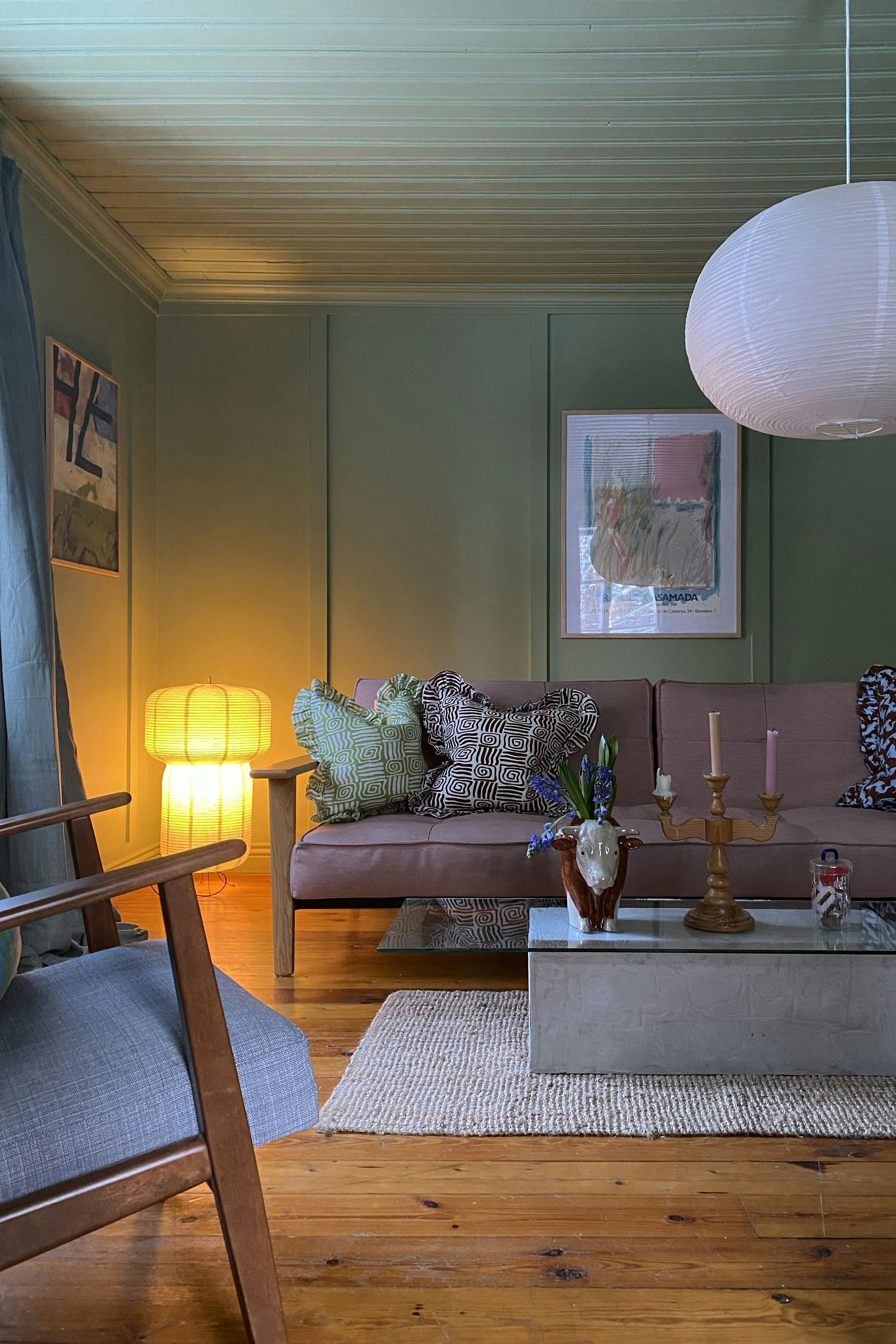
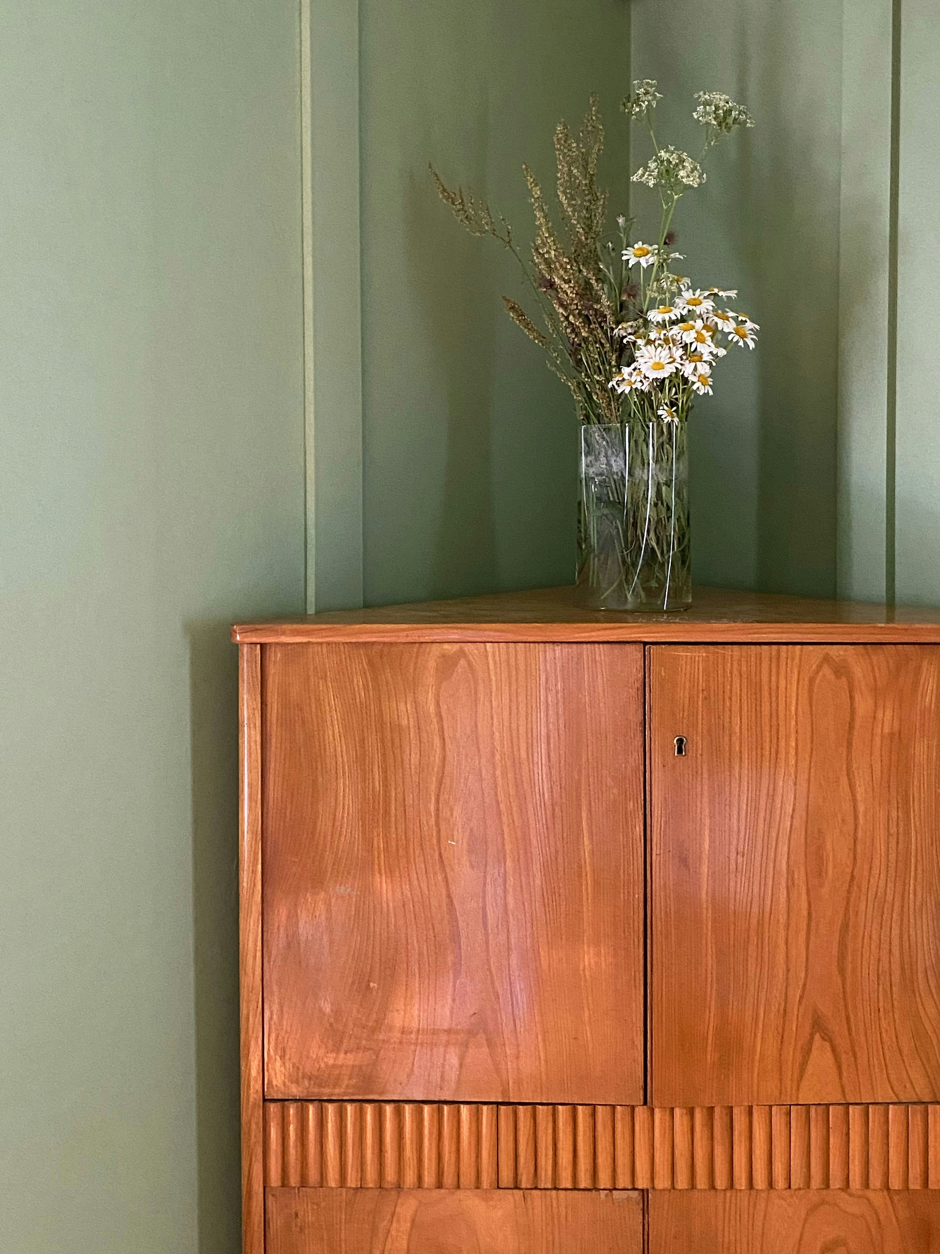
I was immediately drawn to 66 – Inner Space that we chose for the living room because it will blend in seamlessly with the greenery outside during the summer months, but will also feel cozy and a little moody with the fire going in the winter.
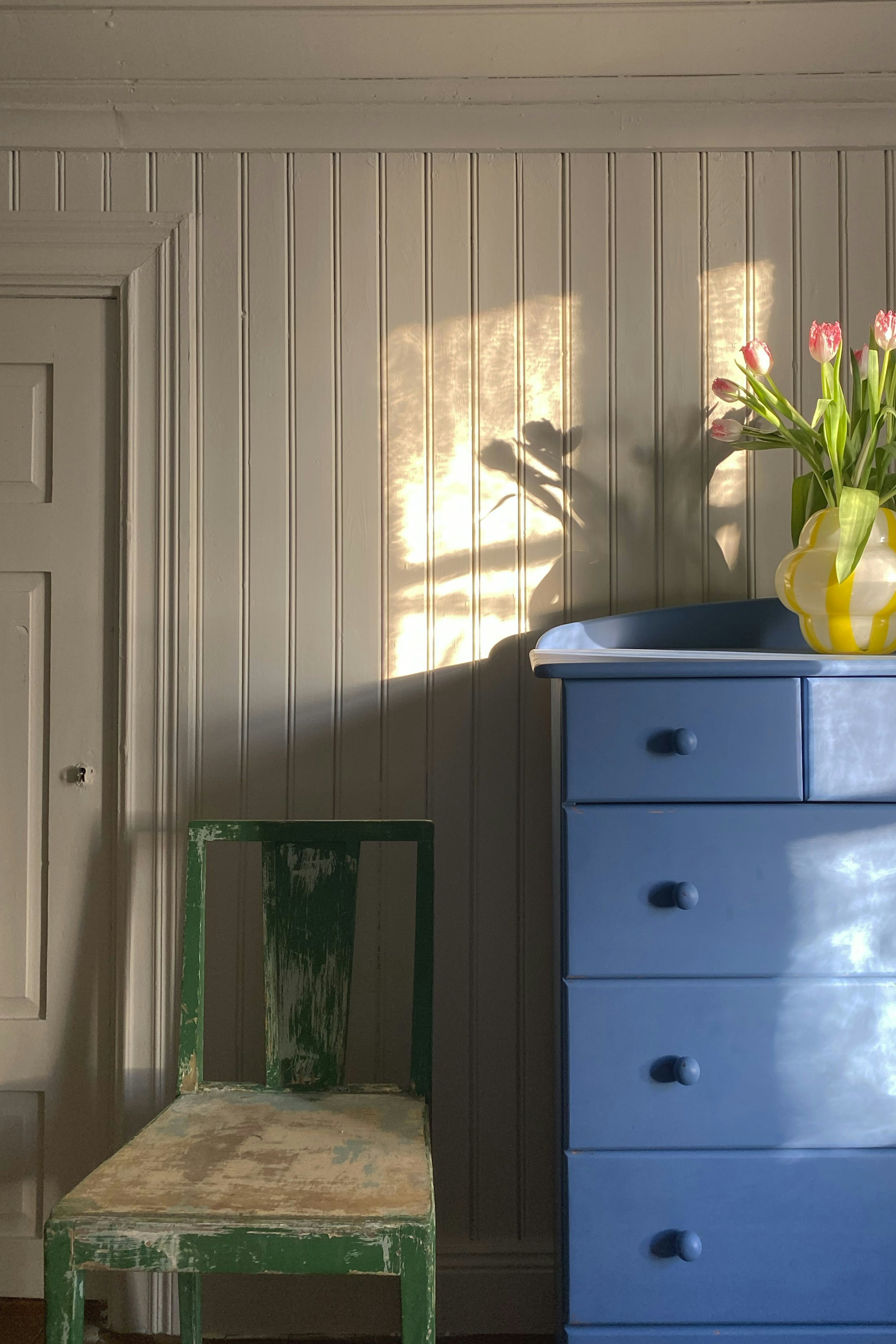
The 62 – Albatross that we picked for the kitchen was an easy choice because the original kitchen was a very similar shade of blue, just a little more grey (and obviously needed freshening up). I like how it has a kind of subtle brightness and is perfect for a classic countryside kitchen.
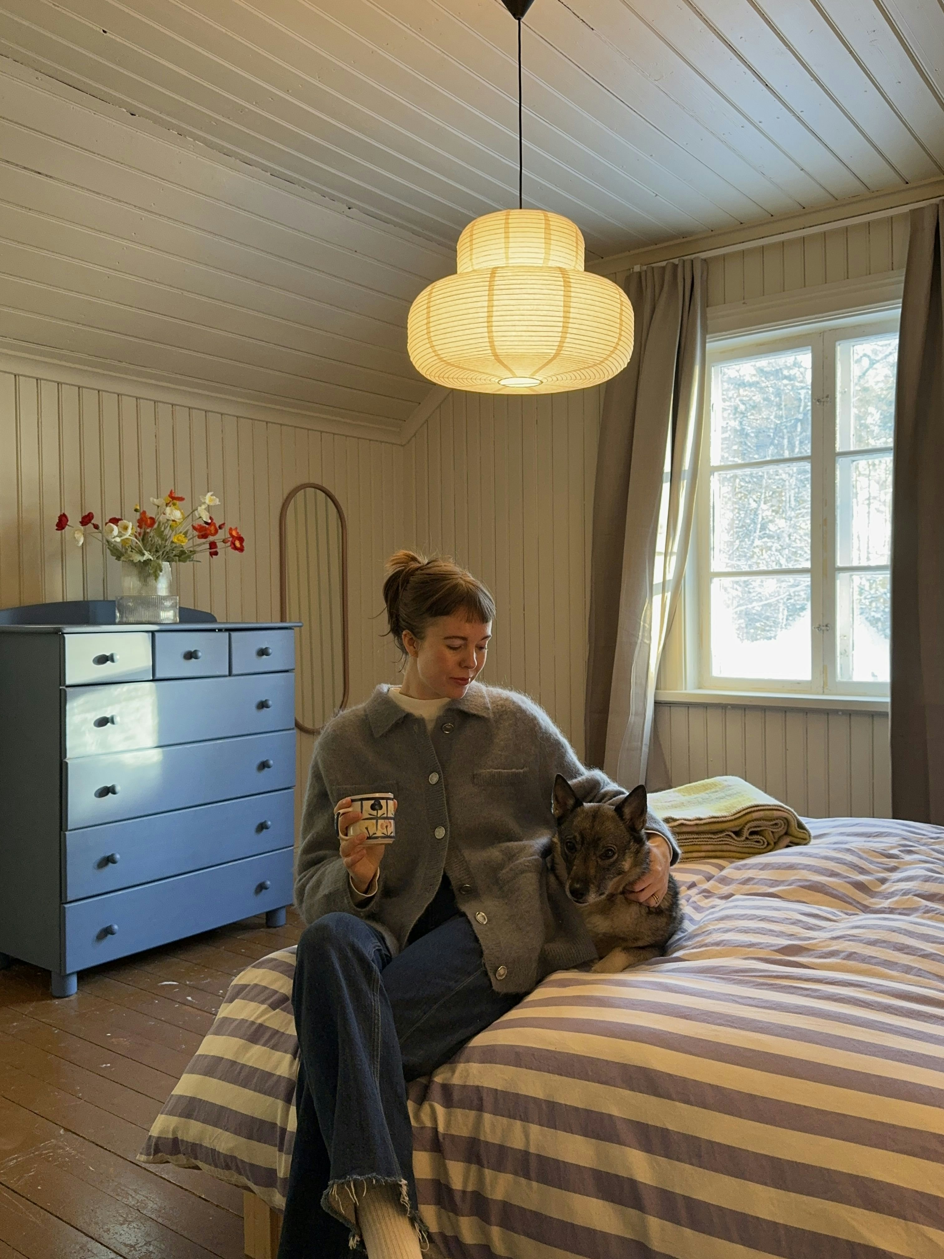
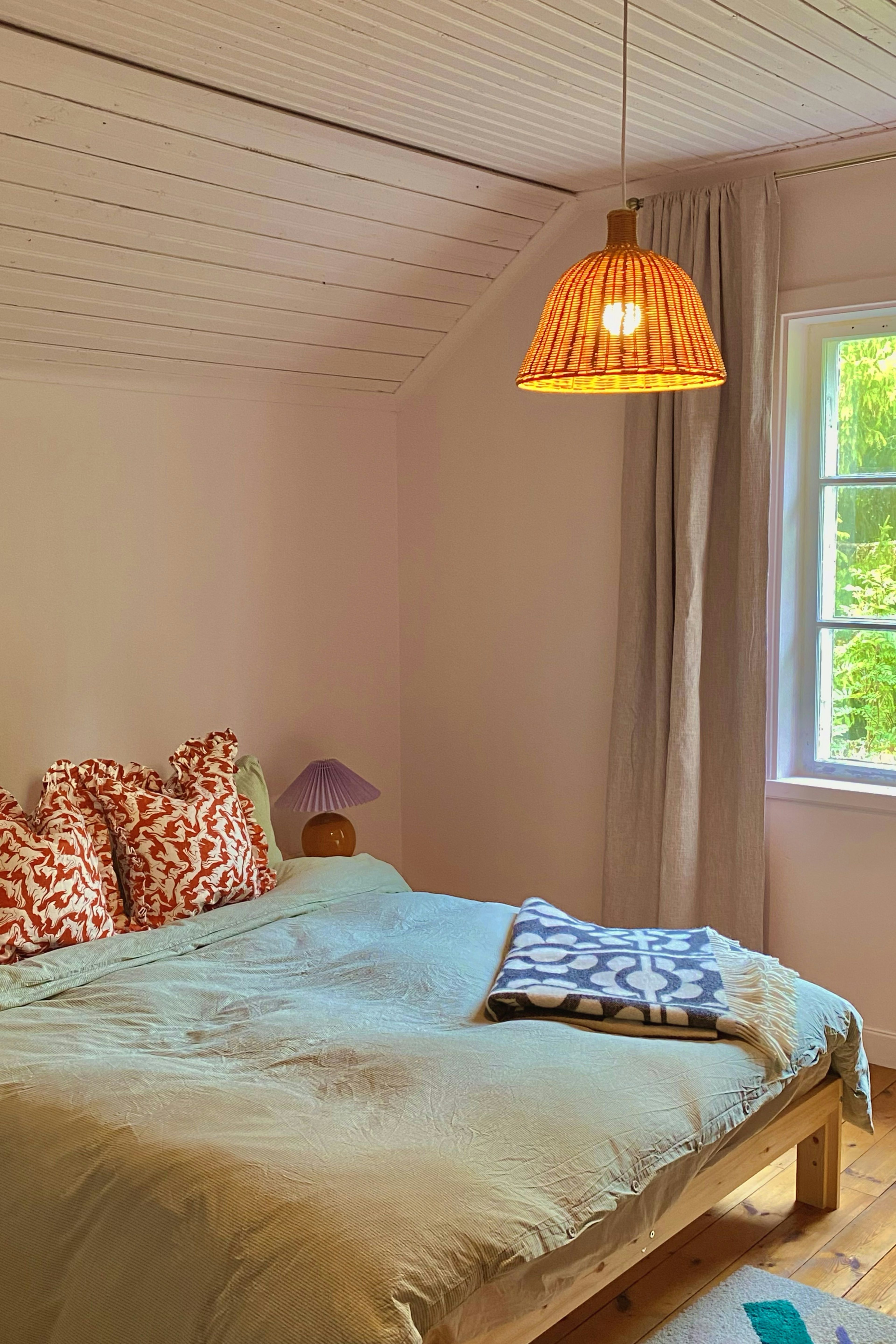
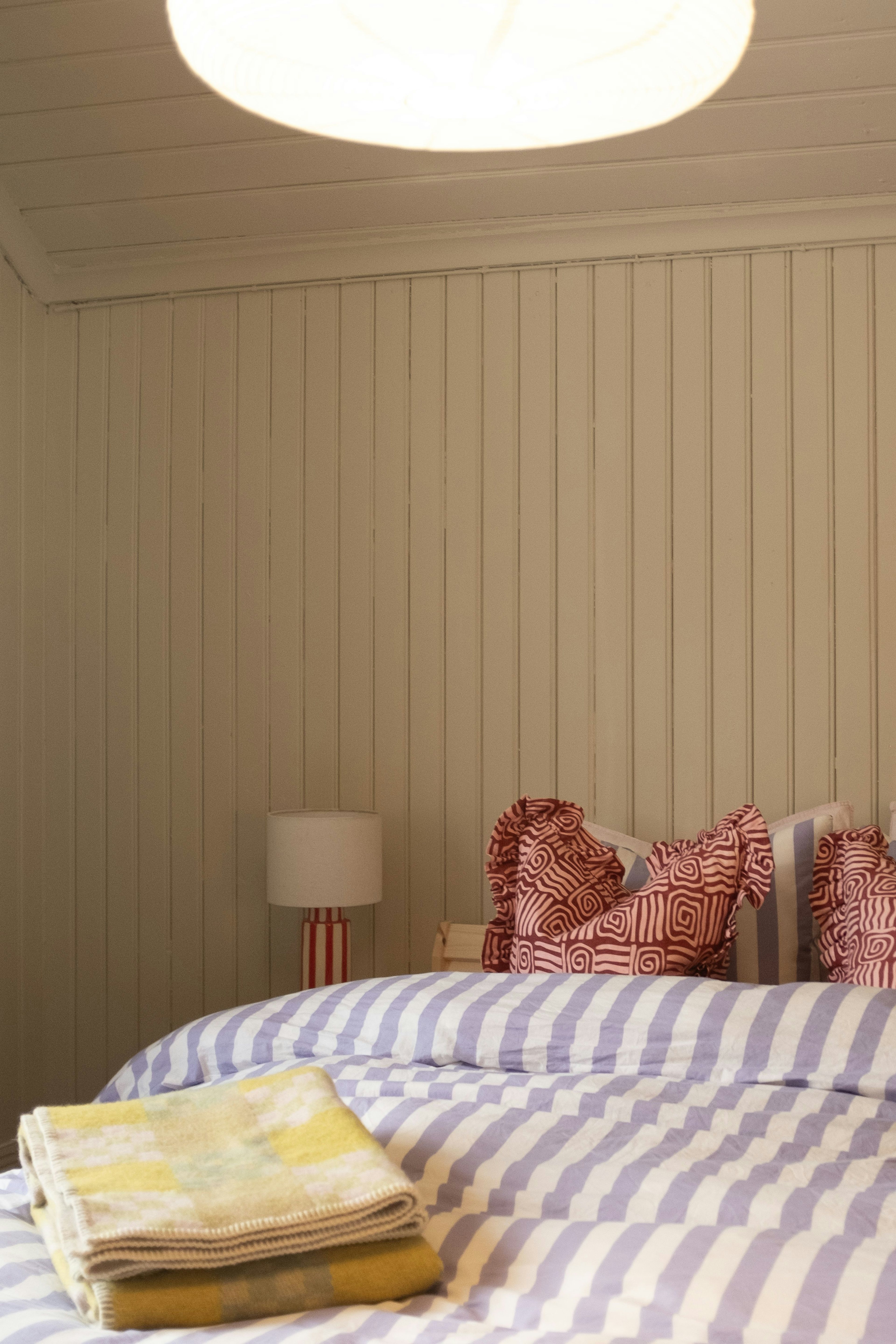
We wanted lighter colours for the two bedrooms upstairs, so we picked light pink 16 – Baby, for the slightly smaller room, and a stoney-beige 9 – Björk, for the larger bedroom. As we planned to paint the sloping ceilings to give the rooms more of a sanctuary/den feeling. I didn’t want to choose colours that could be too intense - and I feel like these choices will be timeless.
What were you most satisfied with?
Watching the house transform! It’s really crazy to look back at photos of how it looked on the day we got the keys, and it’s so rewarding to see your hard work pay off. I also actually found the Klint paint swatches so helpful, especially after spending so long removing wallpapers, spackling and priming the walls - it just felt so easy to stick them up and try them in different areas of the rooms without having to get a paintbrush out. So I would say testing the colours was satisfyingly simple!

Describe your decor style in three words?
Three words to describe the style we've gone for with the house would probably be...colourful country classic? We're really trying to embrace the old charms of the house while also making it feel a little more fresh!
What’s your best tip for anyone who wants to repaint?
Don’t wear clothes you like and try your hardest not to get paint on them, because it will happen one way or another! But also, don’t rush any part of the process - take your time choosing the colours, preparing the walls and definitely spend a good amount of time taping and covering things.
What would be your favorite colour from the Klints colour palette if you had to choose just one?
It’s SO hard to choose just one because there are so many Klint colours I’m drawn to, but if I had to pick one (that I could see myself using) it would probably be 66 – Inner Space! I think it’s a perfect green that has just the right amount of playfulness to it.
The results
Katherine's colours
More interviews
#klinthomes
More inspiration
Get 10% off your first purchase
© Klint 2026, All rights reserved